Best/Worst Baseball Jerseys
As almost anyone who has watched a baseball game in the past decade knows, the vast majority of Major League Baseball's teams have a third, or alternate jersey option. Purists hate them, average fans seem to like them. Marketing departments -- judging by the fact that some teams have several alternate options -- seem to like them too.
This list ranks teams' alternate jerseys (typically the solid colored top) as well as any alternate road uniforms above and beyond the solid top option. Look for a separate ranking of alternate home jerseys in a future posting.
So, without anymore introduction -- the rankings!
THE BEST
Chicago White Sox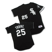
The White Sox pretty much started the alternate jersey revolution so it is only fair that the classic "Good Guys Wear Black" jersey takes top honors. No alternate jersey does as good a job of being both classic and hip at the same time, and the secondary logo on the sleeve seals the deal. The Sox's black top doesn't feel forced because white and black are the team's primary colors. Silver accents around the piping, logo and numbers show that this is a well thought out jersey. Classy enough that it will be stylish for as long as the alternate jersey trend lasts.
Seattle Mariners
A fairly simple jersey, the Seattle Mariners take second place in the jersey rankings because their color scheme works so well for a solid top. The navy base with silver text is crisp and teal accents are very pleasing. Nice use of the secondary logo on the sleeve. Not as loud as the teal tops from Ken Griffey Jr.'s days with the team.
Milwaukee Brewers
A lot of Brewer fans love the glove and ball logo from the 1980s but the current Brewer uniforms have a lot to like. The navy and gold is an excellent evolution from the royal blue and yellow of the Robin Yount glory days. The gold accents around the numbers and "Brewers" script are especially well done.
Boston Red Sox
The Red Sox uniforms are a classic and their third jersey option does a good job of not trying to do too much. Identical to the home uniform in design, the bright red top is a bit shocking at first, but seems to fit the current characters on the team and the needs of the marketing department.
Florida Marlins
Many would argue that this jersey does not belong in the "best" portion of the list, but I feel that the black top with silver "Marlins" is a good look. This jersey rises in the rankings because it gained a little bit of an icon status (as far as the Marlins go) in the 2003 post season. Teal, black and silver outlines around the logo and numbers add a nice bit of pizazz. Sleeve patch is a nice touch.
THE AVERAGE
Houston Astros
The gold "Houston" across the front in script is a good, classic baseball type of look. Texas-shaped sleeve patch fulfills the statutorily required need to honor the lone star state. Good looking jersey -- the Astros might have ranked higher if they didn't have eight million jersey options.
Oakland Athletics
Basic but good looking. The A's jersey doesn't try to do too much. Elephant sleeve patch is much appreciated.
Colorado Rockies
Colorado gets points for putting purple front and center to give this alternate jersey a unique look. Black lettering and numbers are a bit tough to read -- would be interesting to see if they would appear better or simply be ugly if they used silver instead.
Pittsburgh Pirates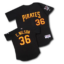
Pittsburgh probably didn't work to hard to design this jersey, but it works well. The red accents around "Pirates" and the numbers keeps this jersey from being too boring. And a pirate on the sleeve...nice!
Texas Rangers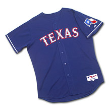
A little more interesting than some of the other tops in the middling classification, the Rangers spruce their jersey up with some white piping around the sleeve. The "TEXAS" across the front is spiffy because it uses silver as an accent color. Team uses the Texas flag to fulfill their state deitification.
Chicago Cubs
There is nothing special nor anything especially bad about this jersey. It is a little softballish because the logo is big and the jersey is plain. Interesting use of the National League emblem on the sleeve -- I believe the Cubs are the only team to do such a thing. Of course one could question why (though the American League thanks the Cubs for making it very clear to all that they do not play where the best teams do).
Put a Wrigley Field logo on the sleeve, wear them on select home games throughout the year, and watch the yuppie money roll in...
Baltimore Orioles
Baltimore's jersey is too plain. Could be greatly improved by using white accents around the name and numbers. The Oriole -- be it cartoon or lifelike -- needs to be brought front and center on the sleeve.
Cleveland Indians Cleveland's alternate option follows the basic pattern of their home and road jerseys in design. This is a fine look, though I'm not totally sold on the white piping and how it interacts with the "Indians" on the front. Red numbers with white outline looks good.
Minnesota Twins
If Minnesota's jersey looks familiar it should. This is basically the Cleveland jersey with red piping instead of white.
Cincinnati Reds
The third jersey option could be a really good look for the Reds, but I just cannot get into the black accents they are pushing.
San Diego Padres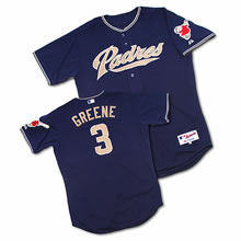
The Padres jersey is not bad, but like all of the Padres current uniforms they don't have a classic feel. Maybe that is part of the easy come, easy go California attitude, but you can't help but think they won't be wearing these in 2010. Not big on the gold semi-collar thingie that also doesn't work well for the Los Angeles Angels of Anaheim or San Francisco Giants. Best part of this jersey? The padre on the sleeve -- why is he not used more prominently throughout the team's image?
THE WORST
Washington Nationals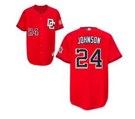
This jersey on its own is not bad -- although I don't like the white logo, dark numbers look. No, the reason this makes the list is really the fault of the Nationals' whole infatuation with block lettering which really does not go with the classic "W" on their caps. Ditch the block lettering, write Washington across the front in script matching the cap and you'd have a heck of a jersey.
Toronto Blue Jays
Hey Toronto, thanks for jumping on the black bandwagon...about a decade late. This jersey ranks among the worst because it is a part of the whole new-look Blue Jays thing, which seems to be a push toward being the black jays. Toronto's new colors and logo stink, thus this jersey must be ranked among the worst.
Tampa Bay Devil Rays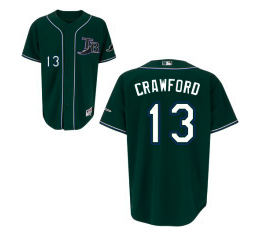
Dark logo + white numbers + white piping = not a good look. The "TB" logo is not especially good, looking like something you might have shipped in from a AAA team if your real jerseys didn't make the flight from your last road trip. The team does get points for using green instead of black as the base color.
New York Mets
My mom always told me that blue and black do not go together. Clearly my mom did not raise the New York Mets (or the Dallas Cowboys for that matter).
The Mets took a big, big step backward when they added black into all of their uniforms a few years ago, as did the Knicks. (Some consulting firm made a lot of money convincing those NY teams to ruin their iconic uniforms).
Ditch the black -- make this a blue top and we'll talk. (Oh, and Mets, if you're thinking of making it an orange top, please don't).
Arizona Diamondbacks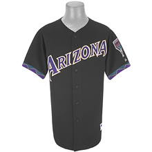
Arizona's jersey probably doesn't deserve to be ranked this low, but I have a hard time OK'ing the early 1990s purple-teal-gold southwestern look. Purple text on a black jersey is hard to read.
Kansas City Royals After that consultant got done with the Knicks and Mets, he clearly hopped a Southwest flight to Kansas City. Their incorporation of black is astonishingly bad and should be stopped immediately. I'm sure some marketing genius calculated that black jerseys would increase sales. He must have forgotten about the product on the field.
Boston Red Sox
Wait a second, wasn't this jersey listed among the best?!? Yes. Yes, it was. I can't help but hate this jersey because it just doesn't go with the classic feel the Red Sox sport so well. It feels forced -- did they need a third jersey?
It makes the best list for being a good natural extension of their current home/road jerseys. It makes the worst list because it is a modernization of their classic jerseys.
Colorado Rockies
One look and you know it. This thing is ugly. I don't care what color sleeves they put with this vest, Colorado needs to bury this thing in an old mine shaft never to be seen again. Well, that or donate the jerseys to a women's softball team.
Atlanta Braves Pass the Tylenol! I've never seen a major league jersey so horrific that it makes my head hurt, but this is it. Ugly, ugly, ugly! You know it gets hot in Atlanta because you'd have to be fighting heat stroke to think this thing was a good idea. The red with navy "Braves" logo is painful and the white accents only help to add to the nausea. The Commissioner's office needs to take action now to ensure that our youth are not exposed anymore to this monstrosity. Hide TBS from your children until this situation is cleaned up.
If you want to buy any/all of these jerseys visit http://shop.mlb.com.


4 comments:
Now I do appreciate the in-depth analysis here but I feel the same way about the third jersey as I feel about the DH. Get rid of it. If I am a Cubs fan (or White Sox fan for that matter) and get the chance to go to Wrigley and see the best (or worst) team in PINSTRIPES, I'll be damn mad if they trot out there in some stupid third jersey. Maybe if the team didn't suck so bad they'd sell more of the regular jerseys.
PS - I think it is pretty sad when you have to censor your own readers. That is just not good, not good at all
What about the sleveless jersey? Does that count as a fourth?
Re: the sleeveless jerseys
That was a difficult issue that I pondered when putting together this list. My general premise was that the third jersey, if it was a dark color made this list. Therefore teams such as the White Sox that have an alternate, home pinstripe, vest jersey will be considered if/when I get around to ranking alternate home jerseys.
Post a Comment